I have been staring at my own Substack covers for a while now, slowly accepting the truth: they look like everyone else’s, and my brand is not as unique as my writing.
Same Nano Banana-default aesthetic. Same vaguely surreal figure floating against a vaguely glowing background. Same sans-serif title slapped on top in whatever font Canva served up that day. If you scrolled past five tech writers’ covers in a row, you couldn’t tell us apart. (I know I couldn’t.)
Thanks for reading The AI Mindset! Subscribe for free to receive new posts and support my work.
So I did the thing I should have done at post #1
I sat down with Claude and worked through every visual decision from scratch. Positioning, palette, typography, illustration style, a recurring character - the whole stack.
By the end, I had a brand system brief I could actually use, a Claude skill that loads it automatically, and a clear sense of what the next ten covers should look like before I’d generated a single one.
A small warning: this is not a “five tools that will transform your brand” post. This is the boring, deciding-things-out-loud part that comes before any tool matters. If you skip it, no amount of Midjourney prompting will save you. (I would know.)
What you’ll learn from #1
The strategic questions you have to answer before you open any design tool - and why “I want it to feel modern and unique” is not an answer.
How to turn your locked-in decisions into a brand system brief you’ll actually use.
Why the Pinterest reference board step is the one nobody does, and the one that might determine everything.
How to generate consistent character images with Midjourney, and why the work of getting one good image is more iterative than anyone tells you upfront.
By the end, you’ll have a clear path from “vague intentions about my brand” to “a system I can run on autopilot.” No tool worship or production roadmap. This is the deciding part - done properly, once.
The first 3 steps to the image
1. Make every decision and turn it into a brand system brief
Before you touch a single tool, you need to make decisions. A lot of them. The kind of decisions that feel boring until you realise that skipping them is exactly why most Substack covers look like they were generated by the same tired AI on the same tired Tuesday.
I’ll spare you the suspense: there’s no shortcut. You sit down with Claude, you answer roughly 26 questions about your publication, your audience, your aesthetic, your character (if you’re using one), and you don’t move forward until every answer is specific. “I want it to feel modern” is not an answer. “Editorial warm-cream #F4ERE0 background, deep ink #1F1B16, muted terracotta #B8552E accent at a 70/25/5 ratio” is an answer.
(Yes, hex codes. Yes, ratios. The vagueness is the enemy.)
The output of this step is a single document - your brand system brief. Positioning, audience, emotional signature, no-fly list, palette, typography, illustration style, cover template, recurring motif, character description. One page. Saved somewhere you can find it again at 11 pm on a Sunday when you’re second-guessing yourself.
I’ve put together the prompt and my own brand system so you can see what “done” actually looks like. (We will be using this brand system brief in Step 3, so hold on to it)
Copy everything between the lines and paste it into a fresh Claude conversation. Answer the questions in order. By the end, you’ll have every visual decision locked.
I want you to act as a brand strategist helping me decide every element of the visual identity for my publication or content brand. Don't suggest tools, production workflows, video pipelines, or automation yet — we're only deciding the what, not the how. Tools come after.
Walk me through the questions below in order. Wait for my answer to each before moving to the next. After I answer, push back if my answer is vague, internally inconsistent, or generic. Make me be specific.
When I've answered all of them, give me a one-page summary of my locked-in brand system that I can save as a reference document.
Part 1 — Strategic foundation
These shape every visual decision downstream. Don't let me skip these.
What is your publication or brand? One sentence: what it's called, what it covers, where it lives (Substack, YouTube, Instagram, podcast, etc.).
Brand architecture. Is this one publication with one identity, multiple sub-brands under one parent, a personal brand with the publication as one expression, or a publication-first brand where you're nearly anonymous behind it? Pick one.
Positioning sentence. Not a topic list — the one-sentence promise to the reader. What does the reader get from you that they don't get elsewhere? If I write "[name] makes [topic] easier to [verb] for [audience]," can you fill that in?
Audience archetype. Who's the specific person you're writing for? Not a demographic — a real archetype. ("Tech-curious knowledge workers in their thirties." "Self-taught designers who think about systems." "Engineers who read fiction.")
Emotional signature. When someone finishes one of your posts, what do you want them to feel? Pick a phrase, not a list. ("Optimistic curiosity." "Productive unease." "Calm clarity." "Dry recognition.")
Visibility level. How visible do you want to be in the brand? Options: face-camera and personal-brand-forward, face-occasionally with publication-forward, voice-only with no face, or fully anonymous with the publication as the face.
The no-fly list. Name three to five aesthetics, brand styles, or tones you absolutely refuse to look like. (This is often easier than naming what you do want — and it's the fastest way to find your lane.)
Part 2 — Production reality
These set the constraints. Be honest. Aspirational answers will wreck you in week three.
Time per post for visuals. How many hours per post can you realistically spend on all visual and brand work — covers, social videos, uploading? (Be specific. "5 hours" is real. "As much as it takes" is not.)
Resources. Are you producing visuals yourself, hiring someone, or eventually planning to?
Budget tolerance for tools. Free-tier only, willing to pay around $20–50/month, willing to pay $100+/month, or willing to invest in a serious tooling stack?
Format scope. Static covers only, covers plus short-form video (Instagram, TikTok, Shorts), or a full content suite including longer video?
Manual vs. automated. Are you starting manual and willing to systematize later, or do you want an automation-first workflow from the beginning?
Part 3 — Visual direction
This is where the brand starts to take shape. Don't let me hand-wave.
Positioning direction. Which of these best fits the brand?
The essayist (literary, serious, longform)
The explainer (clear, diagrammatic, systems-thinking)
The insider (industry observer, sharp commentary)
The practitioner-writer (builder who writes from inside the work)
The cross-cultural observer (lived perspective as differentiator)
Something else — describe it
Colour palette direction. Pick one. (After I pick, recommend specific hex codes that match my positioning, audience, and emotional signature, with a 70/25/5 ratio for primary/secondary/accent.)
Editorial warm (cream, ink, terracotta or ochre)
Editorial cool (bone, navy, muted gold)
High-contrast minimal (off-white, near-black, one accent)
Muted earth tones (clay, moss, sand)
Duotone (two colours only, always)
Something else — describe it
Typography direction. Pick one. (After I pick, suggest two or three specific typefaces that match — free Google Fonts options first, paid alternatives second.)
Serif/serif pair (fully literary)
Serif display + sans body (editorial classic)
Sans/sans with weight contrast (modern, magazine-like)
Mono accent + serif body (tech-literary hybrid)
Something else — describe it
Illustration style. Pick one.
AI-generated editorial illustration with locked style reference
Hand-drawn (by me)
Commissioned from one illustrator on retainer
Photo-based with consistent graphic treatment
Pure typography covers (no illustration)
Geometric / vector / diagrammatic
Single-colour line drawings
Something else — describe it
Recurring motif. What single visual element appears in every cover and ties the brand together?
A recurring character (fictional, lifelike, or stylized)
A specific shape language (every cover contains a circle, arch, grid, etc.)
A consistent frame or border treatment
A recurring object that's thematically resonant (door, window, book, mirror)
No motif — consistency comes from palette and type only
Something else — describe it
Cover template structure. Pick one. (This is the layout grid every cover will follow.)
Title-left, illustration-right (editorial classic)
Illustration-full with title overlaid (magazine-cover style)
Title-dominant with small supporting illustration (typography-forward)
Split horizontal (title top, image bottom, or vice versa)
Framed composition with consistent margins
Something else — describe it
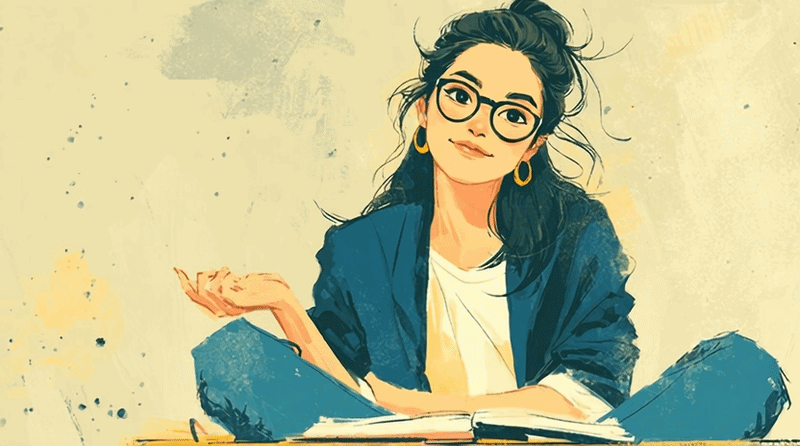
Part 4 — The recurring character (only if I picked one in Q17)
If I'm using a recurring character, walk me through these. If not, skip to the summary.
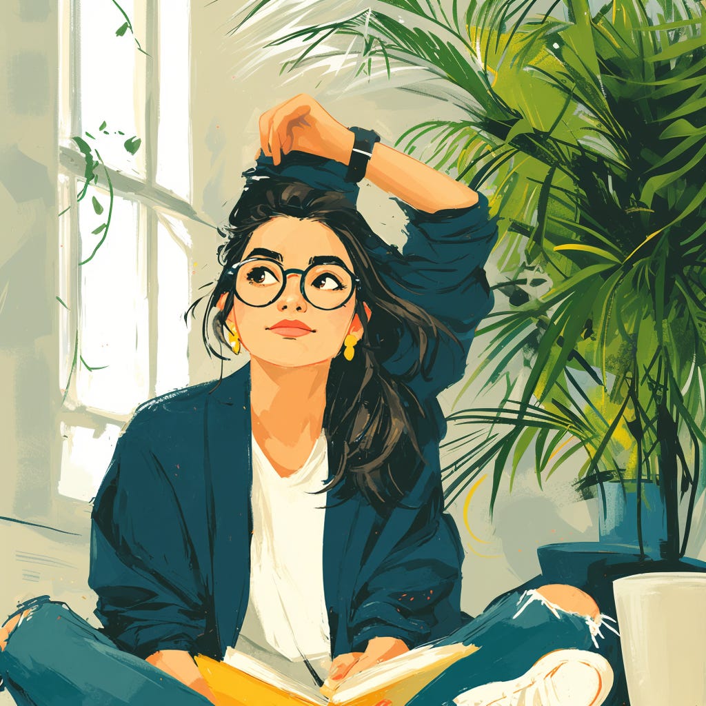
Identity basics. Age range, gender presentation, ethnicity or features (commit to something — "ambiguous" is a valid choice but it has to be intentional), build, general energy.
Face and features. Face shape, three or four specific features that lock recognition (eye colour, nose, cheekbones, etc.), expression default. Push me to be specific — vague briefs produce inconsistent generations.
Hair. Colour (be specific — "chestnut brown" not "brown"), length, style, where it sits, any signature detail (centre part, loose strands, etc.).
Glasses or accessories. If applicable — frame style, colour, material. Pick one and commit.
Wardrobe signature. What does this character wear, every time? Pick one consistent look first. Specify top (style, colour), bottom (cut, wash), shoes (style, colour). After I pick the primary look, suggest one or two seasonal variations using the same palette so I'm not stuck in one weather.
Signature prop. Optional but powerful. Does the character carry something recurring — a notebook, a coffee cup, a closed laptop, a pen behind the ear? Pick one or two.
Default posture and presence. How is the character usually shown — from behind, in profile, three-quarter view, full face? What's their default body language?
Internal name. Give the character a name (you'll never publish it). Names make characters feel real and help with prompt consistency later.
Part 4B — The recurring motif (only if I picked shape language, frame, or recurring object in Q17)
If your motif is a shape language: name the exact shape, its proportions, where it appears in every cover, and one rule for how it interacts with the title.
If your motif is a frame or border: describe the weight, colour, margin, and whether it's consistent across all formats or only covers.
If your motif is a recurring object: name the object, its style (illustrated, photographed, silhouetted), where it sits in the composition, and what it metaphorically signals about the publication.
Final step — the summary
After I've answered everything, output a single document titled "[My Publication] — Brand System" with the sections below. Write each section with the depth of a real brand reference document, not a checklist. The character brief should be a full paragraph (120–180 words) describing identity, face, hair, accessories, wardrobe, prop, and posture in a single flowing description that can be pasted directly into an image-generation prompt. The no-fly list, illustration style, and cover template sections should be 3–5 sentences each — specific enough that someone could execute against them without asking follow-up questions.
Positioning sentence
Audience archetype
Emotional signature
Brand architecture and visibility
No-fly list
Production constraints (time, budget, scope)
Colour palette (with hex codes and ratio)
Typography (titles + body)
Illustration style
Cover template structure
Recurring motif
Character brief (full paragraph, ready to use as a generation reference)
Output the summary as a styled HTML artifact, not plain chat text. Use the user's chosen primary colour as the background, their text colour for body type, and their accent colour for section dividers and the document title. Set the title in the user's chosen display typeface and the body in their chosen body typeface (load from Google Fonts where possible). Use the 70/25/5 ratio in the document's own design — most of the page is the primary background, secondary is text and structure, accent appears only in headers or rules. The document should look like a real brand reference doc the user could screenshot and share, not a text summary.
Format it cleanly. This becomes my source of truth — the document I refer back to every time I make a visual decision.
Don't suggest tools, workflows, or production steps. Just lock the brand.
That's the prompt. The conversation will take about an hour if you take it seriously. The answers you give here decide everything downstream. This is the highest-leverage hour you’ll spend on the entire project. Don’t speedrun it.
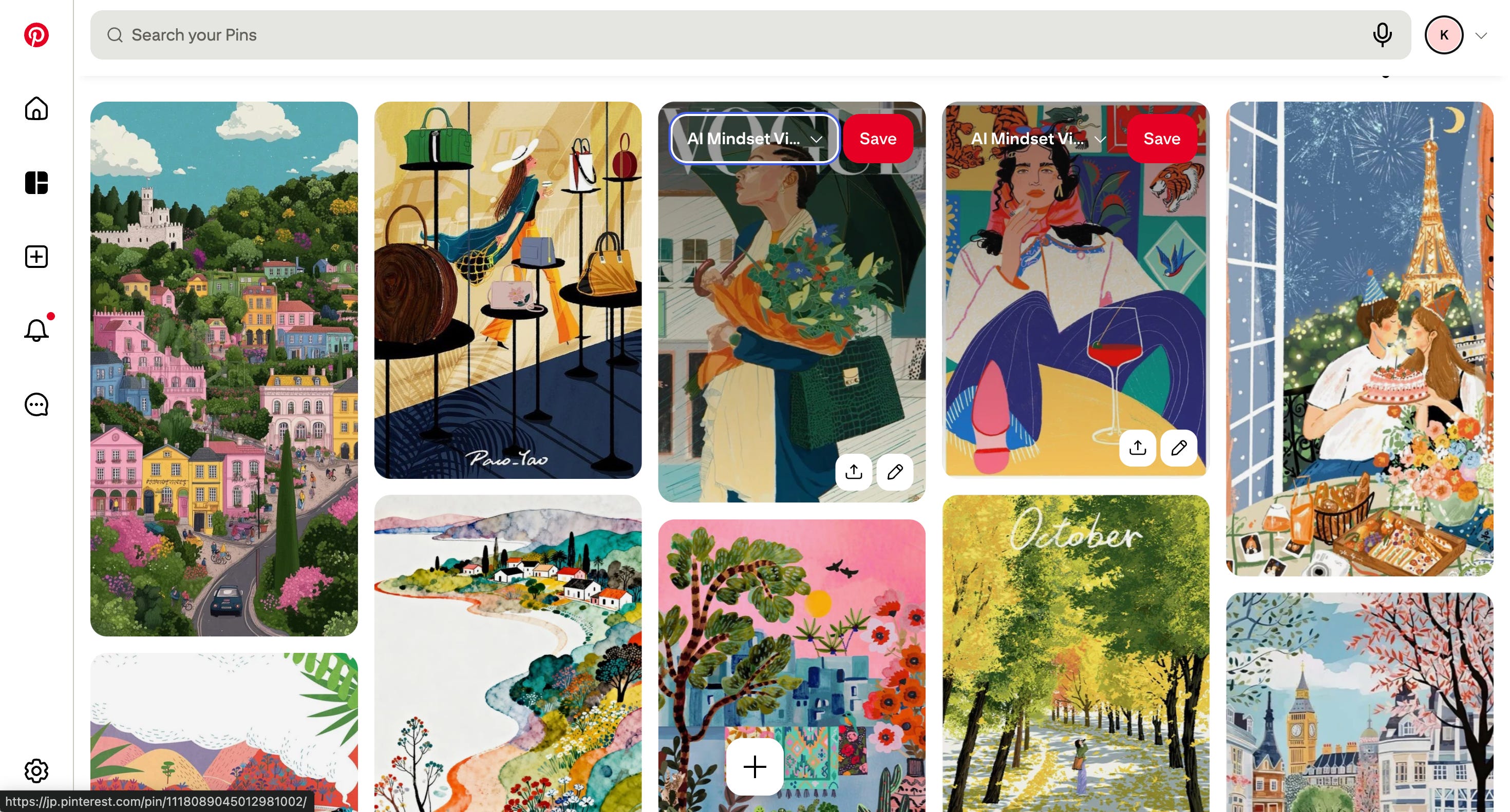
2. Build the reference board on Pinterest
This is the step everyone skips. Don’t.
Open Pinterest. Make a private board called “[Your Publication] - References.” Pin fifty images. Not five. Not fifteen. Fifty.
What goes on the board:
Magazine covers (The New Yorker, The Atlantic, Harper’s, Wired’s better issues)
Book covers (Penguin Modern Classics, FSG, Fitzcarraldo Editions)
Editorial illustrations (Christoph Niemann, Tom Gauld, Malika Favre, Olimpia Zagnoli)
Typography you respond to - even from album art, posters, or random shop signage
Colour palettes that make you feel something specific
Layouts that look like they belong to a publication, not a content farm
What does not go on the board: anything AI-generated. Not one image. The point of this step is to calibrate your eye against work made by humans with taste, not against the same Midjourney-default aesthetic you’re trying to escape.
After fifty pins, scroll back through the whole board and look for patterns. The patterns are your taste. Your brand lives inside them. If your board is half cream-and-ink editorial illustration and half neon cyberpunk, you have not yet figured out your taste - keep pinning until one direction wins.
This step takes one focused hour. Do not move to step 3 without it.
Visual Board for The AI Mindset
3. Learn Midjourney (and accept that it’s iterative)
Midjourney is an image generator. You write a text prompt, and it produces still images. That’s the whole product. It does not produce avatars, characters you can pose, 3D models, or animations - every generation is a fresh still image, made from scratch, based on what you typed.
Now we get to the part where you find out if your taste actually translates. Here’s the workflow that worked for me, after a lot of staring at outputs and going “...no”:
Hand the brand brief back to Claude and ask for a Midjourney prompt
You already have a brand brief from step 1. It knows your palette, your mood, your visual references, the kind of character (if any) that lives in your world. Don’t waste that. Open a new Claude conversation, paste the brief in, and ask it to write you a Midjourney prompt for whatever image you actually need - a cover image for a specific post, an Instagram square, a header.
The Claude prompt I use looks roughly like this:
You're helping me generate a Midjourney prompt.

Below is my brand brief — palette, typography, illustration style,
character details, overall mood. Treat this as the source of truth
for the visual identity.

[paste brand brief here]

I need a Midjourney prompt for: [describe the specific image — e.g.,
"a cover image for a blog post about why I keep abandoning side
projects. Want a sense of quiet self-awareness, not slapstick."]

Constraints:
- 16:9 aspect ratio (--ar 16:9)
- Match the palette and illustration style from the brief exactly
- Include the recurring character if it makes sense, otherwise skip
- Keep it specific: one clear scene, not a vague mood board

Give me the prompt as a single line I can paste straight into
Midjourney. Then below that, briefly explain the choices you made
so I can tweak.
The “briefly explain the choices” bit is the load-bearing part. Without it, you get a prompt and no idea why the camera angle is what it is, so when the output is wrong, you don’t know what to change. With it, you can go back to Claude and say, “Make the lighting warmer, drop the second figure, keep everything else,” and it actually understands what to keep.
(I have, embarrassingly, regenerated the same prompt a couple of times before figuring out that I should just ask Claude to revise the prompt instead of asking Midjourney to read my mind.)
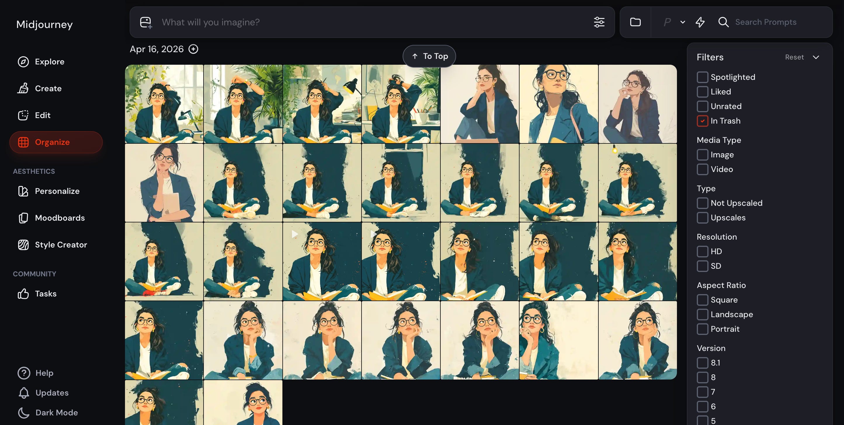
Then: prepare to do this many, many times
Here is the part nobody tells you when they post their finished cover image with the caption “made in 2 minutes with AI 🚀”.
Image generation is iterative. Genuinely iterative.
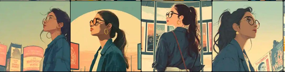
The many iterations of my central character before I got what I had envisioned.
The first prompt rarely gives you the image you want. The second one usually doesn’t either. Somewhere around the fourth or fifth round of “okay, but the character’s hands look like they belong to a different species” is where things start to land.
Looks okay at first glance though…
A few things that I learnt after hours.
The whole game comes down to three parameters. Learn these, and you’re 80% of the way there.
--sref (style reference). You give Midjourney a URL of an image, and it locks the style of every generation to match. Linework, palette, mood. This is the single most important command in the system. Your brand doc has a style direction. --sref is how you make Midjourney actually obey it.
--cref (character reference). Same idea, but for a character. You give it a URL of your character image, and Midjourney tries to keep the same person across generations. Tries. Sometimes succeeds.
Image generations with the same prompt, but no character or style reference added in prompt.
--stylize (0 to 1000). How much of Midjourney’s own aesthetic sense overrides your prompt. High stylize = it does whatever it wants, and the result is gorgeous and generic. Low stylize = it follows your prompt obediently, and the result is sometimes ugly. Editorial work lives around 250.
Stop when it's 90% right. This is the one I personally fail at most. The difference between 90% and 100% is usually another two hours and a fundamentally similar image. Ship it. The post is the thing; the image is decoration. (Important decoration. Still decoration.)
Treat Claude as the prompt editor, not just the prompt writer. When an image is 80% right, don't start from scratch. Paste the original prompt back into Claude with the output description ("the figure looks too cheerful, the palette skewed warm, the background is too busy") and ask for a revised prompt. The revisions are almost always better than your hand-edits, because Claude knows which Midjourney parameters actually move the needle.
That’s it. That’s the toolkit. For now.
Shoutouts
A huge shoutout to AI Meets Girlboss. She writes amazing content on visual branding, and her posts inspired me to start my own journey. I followed her framework to gain clarity on what I wanted as a part of my central character and how to maintain character consistency. Different tools, same framework. Plus, she is super supportive and helpful. Do check out her blogs.
Tina Nayak, Alyssa Fu Ward, PhD and Jason Ives initially commented positively on my character design notes, and I can’t thank them enough for being so supportive.
What’s coming next
Two things I want to dig into in the next post, both of which are downstream of what we just did:
Turning your brand brief into a Claude skill. Right now, your brand brief lives in a doc somewhere, and you’re pasting it into Claude every time you need a new image prompt. That works for a week. Maybe.
Why image generators produce garbage text, and the embarrassingly simple fix. There’s an actual reason this happens. Image models think in pixels, not characters, and there’s a simple workaround that I avoided for an embarrassingly long time because it felt like cheating.
See you next week. Probably. (You know how this goes.)
I loved seeing you use the framework and bring it to life through your own visuals.
Visual branding is often treated like the “nice-to-have lipstick” at the end, when actually it’s one of the fastest ways to make people understand what your world feels like before they’ve even read a sentence.


Aww I didn’t realize you gave me a shoutout thank you! I think the rebrand looks beautiful. I love the colors and vibe.
Thanks for sharing with us the details on how we can build our own beautiful and distinctive brand!
Thank you so much for the shoutout. 🩷
I loved seeing you use the framework and bring it to life through your own visuals.
Visual branding is often treated like the “nice-to-have lipstick” at the end, when actually it’s one of the fastest ways to make people understand what your world feels like before they’ve even read a sentence.
Beautifully done👏👏🦩